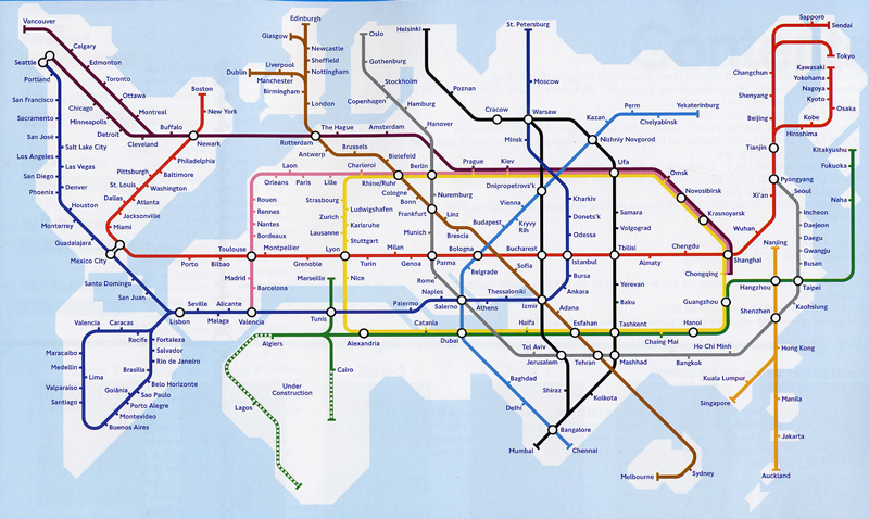
The map below has been floating around the web recently, and I realized it came from a book I’ve had on my desk for two years now: Transit Maps of the World by Mark Ovenden.

Ovenden’s book, published in 2007, details the history of transit maps in each city with a metro system. The book starts off in the world’s oldest and largest systems (New York, Tokyo, Paris, London) and moves into the more recent systems that only have a small history of transit maps and few metro lines to speak of. For each city, Ovenden discusses how the maps changed over time. The most common trend is for a city’s maps to start as a geographic representation of the city with transit lines drawn on it and the move into the abstract. The map abstractions of the city often just show the transit lines and a key geographic feature or two, like the map above. Ovenden discusses city’s choices of station markers, colors, angles, and transfer points.
Only four years old, the book already is missing many cities with brand new metro systems (blame China for that!), but is a great compendium of all the systems in the world up until 2007.

It really is amazing how close the world map looks to the London Underground map. This is intentional, of course, but still remarkable.
I love this book! One of the best gifts I’ve ever gotten.
Whoever drew that map is stupid. On the blue line they have San Jose then Sacramento then San Francisco. That makes no fucking sense.