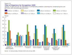
This is from a US Census Bureau report summarizing commuting trends in the recently public American Community Survey. The colors denote departure time and the groups of columns show different professions.
My sense is that this organization is backwards. Time is ordered and linear, while occupation is categorical. This seems to suggest that time should be the x-axis and occupation the bars. But really, we need to ask- why not use a line chart? This would be much cleaner. Ten points to the person who makes this chart intuitive and beautiful.


Your first suggestion (switching the organization) would clearly be better. I don’t think that a line chart would be appropriate, though, because connecting the data points could imply that they are continuous, which clearly they are not; people who leave for work between 5 and 6 pm don’t usually go on to leave again between 6 and 7.
Believe it or not, I actually did start to go after those 10 points. Fun exercise.
While the chart does not imply the data are continuous, it does represent a continuous situation. You’re right that people don’t leave for work twice, but the graph is a probability density function, which is almost always represented as a line.
The ACS asks people to name the time they usually leave for work; any bins or categories on departure time are manufactured in post-processing. I think a line would be better, because people who leave for work at 7:55 AM likely have much in common with people who leave at 8:05 AM, even though they may be put in separate arbitrary categories.
I see what you mean. Well reasoned.